Financial services identity · Building trust in a crowded market.
A regional finance brand needed a bold, trustworthy identity that could stretch from debit cards to billboards and still feel unmistakably African.
- 3 weeksIdentity sprint
- 18+Logo variations
- 5Primary use-cases
Stand out and still feel credible.
The client was competing with banks that all looked the same. They needed a mark and system that signalled security but still felt energetic and current to younger customers.
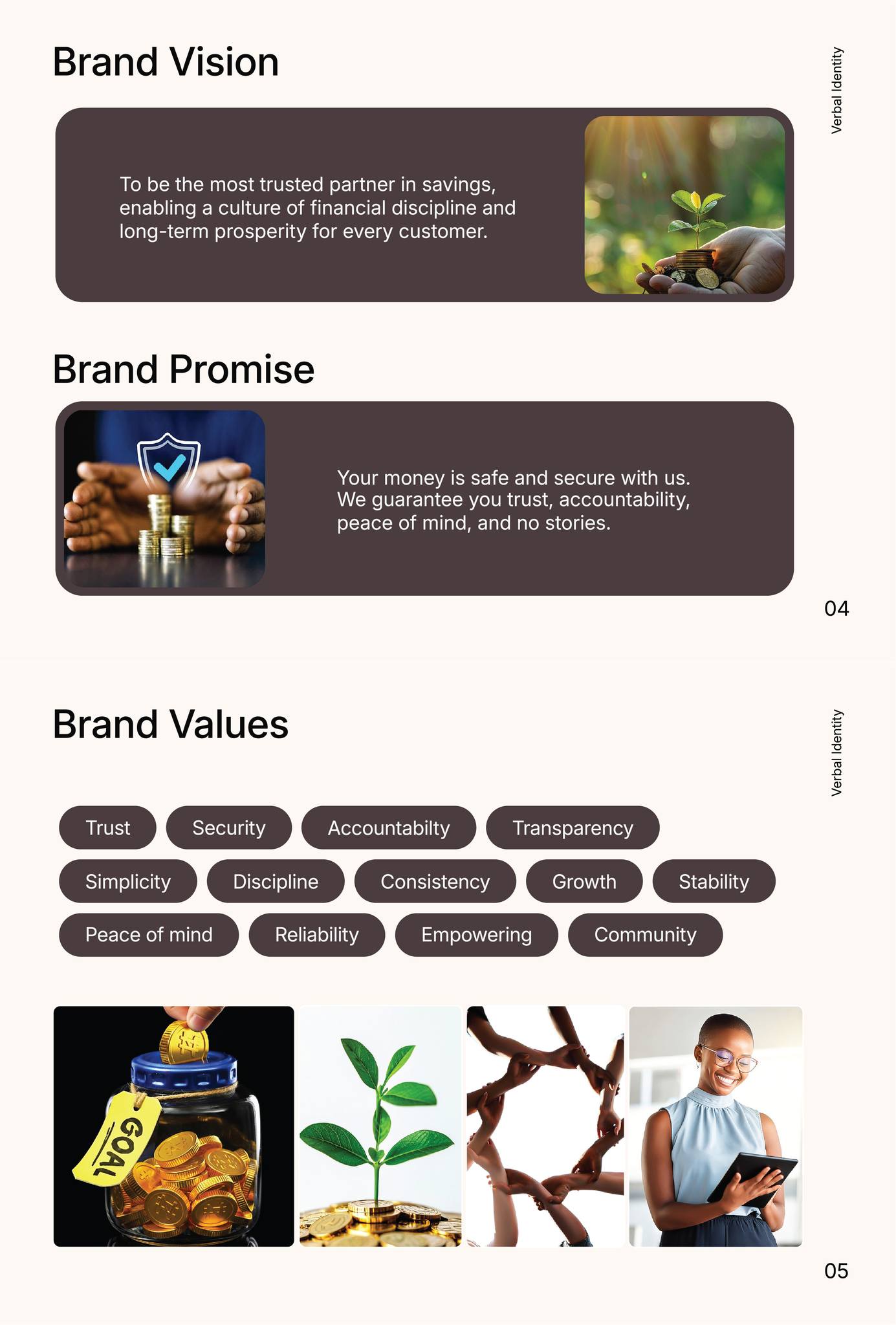
Logo system, type and colour built together.
We explored multiple wordmarks and monograms, landed on a flexible lockup and then paired it with a typographic and colour story that could flex from mobile apps to physical signage.
Logo suites for dark and light backgrounds, small sizes and social avatars.
Typeface pairing, grid rules and spacing tokens to keep everything consistent.
Business cards, social skins and presentation templates for the internal team.
Need a fresh identity?
Lets design a logo system that can actually scale.
Tell us about your audience, channels and launch plan—we'll reply with options for logo suites, brand guides and roll-out assets.